Categories
Ideabook Wayfinding and Space Design

Service Help Centers in airports, based in JFK Delta airport terminal

I have been scouting out service design inspirations, particularly from airports, that courts could use. This one is from JFK airport, in the Delta terminal. I was very impressed with their service design. They had taken over an entire gate with a help center that had all kinds of touchpoints: paper, phone terminals, people, kiosks. There were multiple entry points and lots of capacity, so that people could self-sort depending on the magnitude of their issue, the speed they needed it resolved, and their comfort with tech.

Of particular interest: the Need Help card. Can we make these for all courts?

Categories
Current Projects Wayfinding and Space Design

Trends in Courthouse Design : a profile of new space designs

The National Center for State Courts has a 2004 article from Don Hardenbergh, president of Courtworks, on Trends in Courthouse Design :: Courthouse Facilities.

In the article, Hardenbergh profiles the move to use the space of courts to make the judicial system more accessible, navigable, and open to the public. It is because of the increasing focus on service design and customer-oriented services.

This means more spacious waiting rooms.

Better public information and signage.

More support for child care and entertaining environments for them.

Concern and protection for victims and witnesses.

More pleasant treatment of juries.

Easier access to information and services.

Interventions to reduce waiting times and lines.

This means more working spaces and areas for pro se litigants, in particular, as well as more working spaces and counters for people who are trying to carry out tasks.


Categories
Current Projects Wayfinding and Space Design

Hospital map app

An Ohio hospital has created an internal navigation system through a mapping app. It lets anyone find their doctor or destination by putting it into the app, and getting step by step directions about where to go.

Mercy Health’s Jewish Hospital has created a customized mapping system to help patients or visitors find their way around the Kenwood facility.

The app is here for download on ios. It’s also available on kiosks in the hospital, where you can print out directions.

Source: Mercy Health’s Jewish Hospital creates smartphone mapping system: Cincinnati Business Courier

Categories
Wayfinding and Space Design

Wayfinding signs with language access from hospitals

These were sent from a Kaiser Health facility in California as examples that a court could possibly follow.

Categories
Ideabook Wayfinding and Space Design

Making the court Self Help Center more friendly and human

Could we remake the Self Help Center to be more colorful, friendly, and humanized?

This could be with more art on the wall, with more aesthetically and purposefully structured walls of resources. It could also have things for toddlers and other kids to focus on, so that they are focused, calm, and not distracting their parents and others.

Categories
Ideabook Wayfinding and Space Design

Big Maps of legal service providers, on the wall and in handouts

What is it?

Have standardized maps of all the court’s floors and rooms, as well as adjacent buildings. These should use the color scheme to direct people on a certain pathway to the right location. It should have plentiful white space, so people can annotate their paper map with where to go. The maps should be like those in malls and museums — clean and annotated.

The maps can be of streets, if there are many providers in the neighborhood.

It can be of the building, to know where to go within a large complex place.

Or it could be of a city/county, to get a wider collection of providers on the same sheet.

How could it be implemented?    

Take or create the existing floor plans of the court, and then review them to make them clean, oriented towards common user pathways, and with the same font and color choices for the other signage. Then create poster, print handout, and digital versions of all of them.

This will likely take one to two months to design, and $1000 to create the signage.

Categories
Ideabook Wayfinding and Space Design

Numbering Line System for self help services

How can we make lines in courts less painful?

One idea is to have a numbering system. People can take a number and hang out til their number is called — instead of waiting in line and getting exhausted and frustrated.

The numbering system would have paper numbers to take, along with a digital system to count and announce the numbers that are up for service, with instructions on where to go.

We took this model from the DMV, that had a more coordinated numbering system. It let people hang out and sit down, rather than waiting in long lines.

Categories
Ideabook Wayfinding and Space Design

Signs that clarify relationship between Advocates and People

One of the needs we uncovered at the Self Help Centers in courts was to make it clear to people that they couldn’t expect full legal representation. The courts wanted to make sure they didn’t expect full confidentiality or an ongoing relationship.

To do this, we propose a poster that could also be replicated as handouts or cards.

It would lay out key points about the relationship in large fonts, with messages in bolds. It would have icons and pictograms to illustrate the points.

Categories
Ideabook Wayfinding and Space Design

Welcome to Court! colored, problem-oriented signs

What is it?

Posters and other large-scale signage that can be placed physically throughout and around the court building, and on any web- or mobile-based court technology. It would reach out to people considering using the court by framing the problem in words they understand, using iconography and colors. It would give the person a ‘pathway’ view of what resources are available for their issue-area, and help them understand what applies to them.

How could it be implemented?    

Work with a visual designer to choose the right color scheme, fonts, and icons. Work with a content expert to choose the most important issues, and how people talk about them. Then create outreach signage that features the pathways of these issues, and that presents it in ways that will engage the target audience.

This will likely take several weeks to a month to design, and $1000 to create the signage.

Our design notes

Courts and associated legal actors must implement a coherent, user-centered signage system. It should be with larger fonts, consistent color coding, and use of pictograms. The names should be consistent across all signs, and they should be phrased in terms of the problem or task of the user that they are addressing, rather than the term that the legal system has created for them.

  • Signage review — does it all point to where you want to go
  • Large, colored signs
  • Bigger text, more graphics,  having pictograms to refer to
  • same name across all signs
  • Links of all the different offices and places to these same core problems of the users — clearer delineation of all the services that start with “Family Law”
  • Phrased in terms of users’ problem and their language (not legal categories) —  action oriented tasks rather than ‘insider terms’ for the organization
  • Main other language on the sign too — Spanish in this case
Categories
Ideabook Wayfinding and Space Design

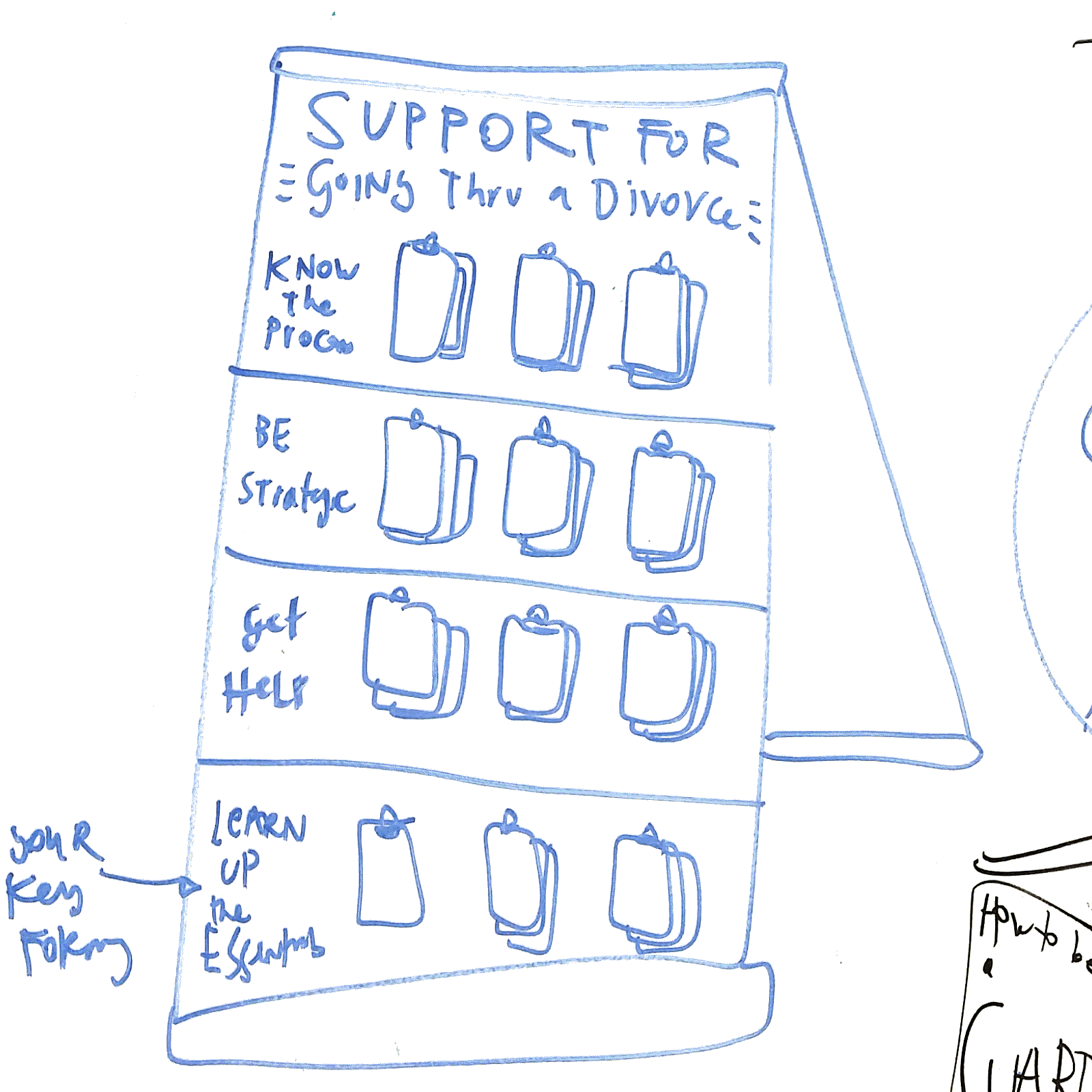
Court Resource Easel Board


What is it?

It is a standing easel, about five feet high, with clips to attach a series of booklets. It would be more attractive than a standard “Wall of Handouts”, and it would have more structured categories and flows of resources to take.

For example, each easel would be for a specific Problem, and then each row of resources would be for a specific task to do within that task. There would be labels and context for what the handouts are — so people know what to take, and why they’re taking them.

How Could It Be Implemented?

The Courts could buy easels, attach clips to them, and then affix labels/colors to the easels to make the distinct rows and titles. Then, they would have to stock the easels with the correct resources each day to ensure sufficient ones are present.

Planning beforehand would be required, to decide which Problems should get their own Board, and then what the key tasks/categories should be for each board. Finally, the planning team would have to decide which documents or other resources should go on the Board.