Categories
Ideabook Wayfinding and Space Design

Big Maps of legal service providers, on the wall and in handouts

What is it?

Have standardized maps of all the court’s floors and rooms, as well as adjacent buildings. These should use the color scheme to direct people on a certain pathway to the right location. It should have plentiful white space, so people can annotate their paper map with where to go. The maps should be like those in malls and museums — clean and annotated.

The maps can be of streets, if there are many providers in the neighborhood.

It can be of the building, to know where to go within a large complex place.

Or it could be of a city/county, to get a wider collection of providers on the same sheet.

How could it be implemented?    

Take or create the existing floor plans of the court, and then review them to make them clean, oriented towards common user pathways, and with the same font and color choices for the other signage. Then create poster, print handout, and digital versions of all of them.

This will likely take one to two months to design, and $1000 to create the signage.

Categories
Ideabook Wayfinding and Space Design

Numbering Line System for self help services

How can we make lines in courts less painful?

One idea is to have a numbering system. People can take a number and hang out til their number is called — instead of waiting in line and getting exhausted and frustrated.

The numbering system would have paper numbers to take, along with a digital system to count and announce the numbers that are up for service, with instructions on where to go.

We took this model from the DMV, that had a more coordinated numbering system. It let people hang out and sit down, rather than waiting in long lines.

Categories
Ideabook Work Product Tool

Better Cover Sheets on Forms

We identified that Form Packets are a central ‘thing’ in the Court System. People come to court for help, and the Clerks and Self Help Centers deliver them help through a large selection of paperwork. These papers, most especially forms, are the key commodity in which their help is communicated — and what they can walk away with.

With that in mind, we propose a new Cover Page for a form packet.

It should be human-centered, with icons, pictograms, or other visuals of people.

It should be conversational, almost as if a helpful advocate is talking to the person through the sheet.

It should prep the person for what the packet contains, and what to do with it.

It should flag common problems, and key things to remember.

Categories
Ideabook Procedural Guide

Giant Visual Storyboards in legal buildings (and elsewhere)

Our proposal is for courts to make huge posters to display on the walls, that lay out the steps of a legal process. They can be replicated on handouts and brochures.

These giant maps would show an illustrated way that a person would get through the individual tasks. They could also show the back-and-forth between a person, their advocate, and the court.

They would address the need we saw, that people can’t get a clear bird’s eye view of how the system works and what to expect from the process. The map could help them contextualize the journey they are on, and to see what to plan for.

Categories
Ideabook Wayfinding and Space Design

Signs that clarify relationship between Advocates and People

One of the needs we uncovered at the Self Help Centers in courts was to make it clear to people that they couldn’t expect full legal representation. The courts wanted to make sure they didn’t expect full confidentiality or an ongoing relationship.

To do this, we propose a poster that could also be replicated as handouts or cards.

It would lay out key points about the relationship in large fonts, with messages in bolds. It would have icons and pictograms to illustrate the points.

Categories
Ideabook Wayfinding and Space Design

Welcome to Court! colored, problem-oriented signs

What is it?

Posters and other large-scale signage that can be placed physically throughout and around the court building, and on any web- or mobile-based court technology. It would reach out to people considering using the court by framing the problem in words they understand, using iconography and colors. It would give the person a ‘pathway’ view of what resources are available for their issue-area, and help them understand what applies to them.

How could it be implemented?    

Work with a visual designer to choose the right color scheme, fonts, and icons. Work with a content expert to choose the most important issues, and how people talk about them. Then create outreach signage that features the pathways of these issues, and that presents it in ways that will engage the target audience.

This will likely take several weeks to a month to design, and $1000 to create the signage.

Our design notes

Courts and associated legal actors must implement a coherent, user-centered signage system. It should be with larger fonts, consistent color coding, and use of pictograms. The names should be consistent across all signs, and they should be phrased in terms of the problem or task of the user that they are addressing, rather than the term that the legal system has created for them.

  • Signage review — does it all point to where you want to go
  • Large, colored signs
  • Bigger text, more graphics,  having pictograms to refer to
  • same name across all signs
  • Links of all the different offices and places to these same core problems of the users — clearer delineation of all the services that start with “Family Law”
  • Phrased in terms of users’ problem and their language (not legal categories) —  action oriented tasks rather than ‘insider terms’ for the organization
  • Main other language on the sign too — Spanish in this case
Categories
Ideabook Procedural Guide

Customizable Process Map


What is it?

Have a standardized paper map of the steps in a legal process laid out, with tasks, hand-offs, and roles.

This map can then be marked-up and customized by the user and by lawyers and court staff, to help them understand the process in terms of their own situation.

Ideally, it would be visual — with icons and illustrations of the steps.

How could it be implemented?

A design team maps out the basic, standard process for a given Legal Issue area (e.g., child custody, divorce, etc).

They vet it with court experts.

Then they print these one page maps out, ensuring there is generous white space on the page for annotations.

If there are common note-taking-points, these can be designated on the map with a box or question bubble.

It would likely take 2 months and under $500 to implement.

Categories
Ideabook Wayfinding and Space Design

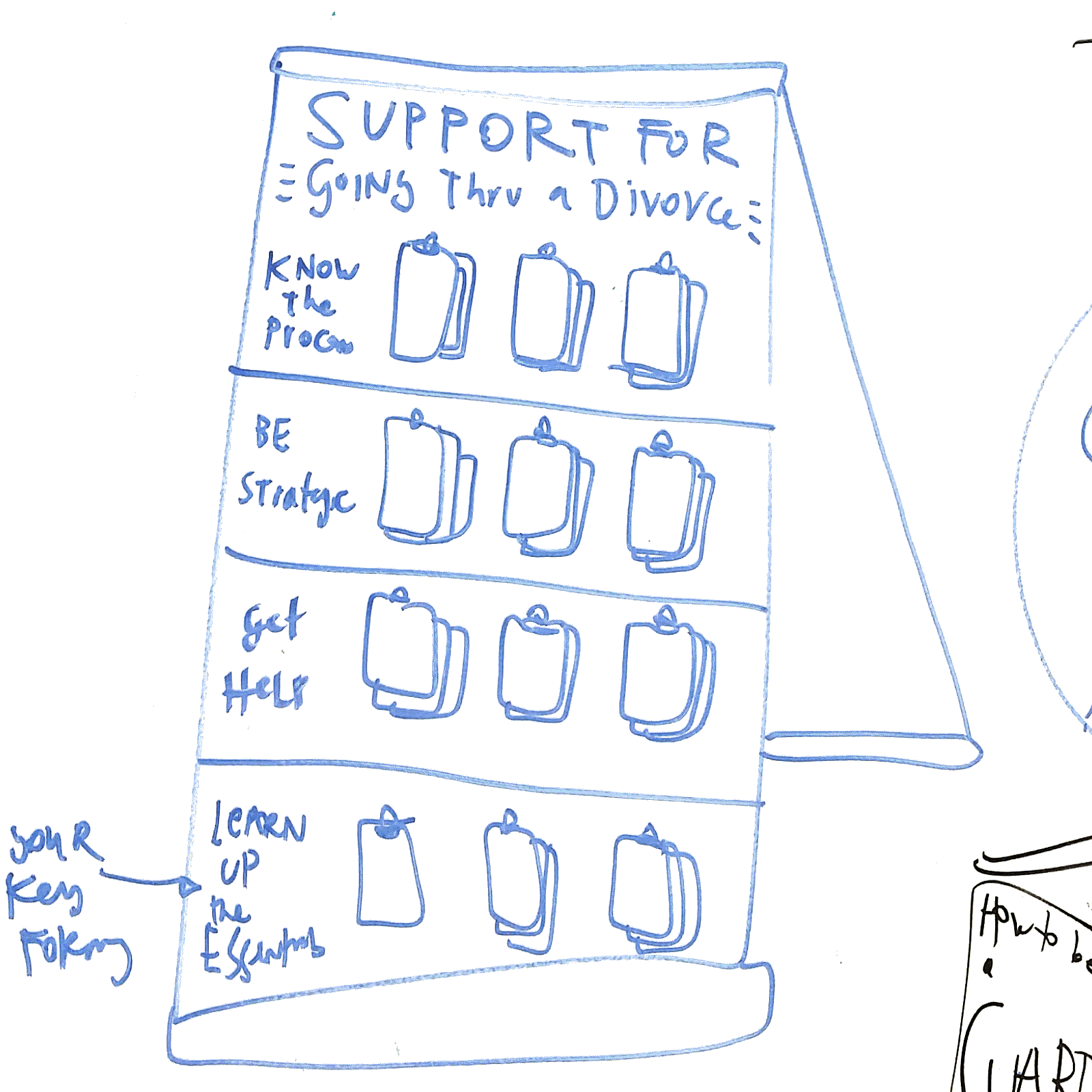
Court Resource Easel Board


What is it?

It is a standing easel, about five feet high, with clips to attach a series of booklets. It would be more attractive than a standard “Wall of Handouts”, and it would have more structured categories and flows of resources to take.

For example, each easel would be for a specific Problem, and then each row of resources would be for a specific task to do within that task. There would be labels and context for what the handouts are — so people know what to take, and why they’re taking them.

How Could It Be Implemented?

The Courts could buy easels, attach clips to them, and then affix labels/colors to the easels to make the distinct rows and titles. Then, they would have to stock the easels with the correct resources each day to ensure sufficient ones are present.

Planning beforehand would be required, to decide which Problems should get their own Board, and then what the key tasks/categories should be for each board. Finally, the planning team would have to decide which documents or other resources should go on the Board.


Categories
Ideabook System Evaluation

Happy/Not Happy card

A model for feedback is the Happy/Not Happy card, a simple folded card that gives the user two sets of things to do to give feedback. It comes from a headphone company, Anker. They include this card with their product, to give a very clear set of steps to follow up with feedback.

Categories
Ideabook Procedural Guide

Story-examples to show human process

What if courts documented real-life stories of people who went through various processes, and how they did so. This could be through pictures and words, or through interactive media or videos. It would give the user a sense of how others have used the process, what background they came from, and what they achieved.

This idea is partly inspired by testimonials that come along with exercise programs or diets. Or, like the following images, a booklet describing different birth control methods, and describing how different women chose different ones, why, and how they went about it.

wise-design-birth-control-guides-and-support-bedsider-2016-03-26-13-08-43 wise-design-birth-control-guides-and-support-bedsider-2016-03-26-13-08-31 wise-design-birth-control-guides-and-support-bedsider-2016-03-26-13-08-23 wise-design-birth-control-guides-and-support-bedsider-2016-03-26-13-08-16 wise-design-birth-control-guides-and-support-bedsider-2016-03-26-13-07-56 wise-design-birth-control-guides-and-support-bedsider-2016-03-26-13-07-24 wise-design-birth-control-guides-and-support-bedsider-2016-03-26-13-07-20