
What if every person had a lawyer that was closely related to them, that was responsible for advising them and keeping them legally healthy, and dealing with any problem that arises for them.

What if every person had a lawyer that was closely related to them, that was responsible for advising them and keeping them legally healthy, and dealing with any problem that arises for them.


Could we build a smart system inside courthouses that provide Internet access, connections to printing/copying, and electrical power for all those who need to be computer-connected while doing their business in the court?

What if legal aid groups banded together, to make their office, software, services, and other purchases together? If they buy in bulk and together, they can negotiate better prices, licenses, and other terms. A platform could bring these groups together to make smarter decisions (based on the wisdom of the group, so that each group doesn’t have to relearn the space or redo the negotiations). It can also save them money and time, and get more favorable conditions.
This idea came out of the Florida 2015 Legal Aid Summit, and was a finalist for the awards.


Could we take the workshops that self-help centers already run in person, and make online versions of them to get wider distribution? To people who can’t travel to self-help centers or need it during weekends or evenings? If we package up the guides into more usable formats, we can help amplify their impact.


What if we made templated, user-tested Cover Sheets to all legal tasks (whether it’s filling out forms or going through a procedure) so that people have great introductions and orientations to the task before being asked to do it?

Inspired by the civic technology project CityVoice, that lets any person call up to leave a voice message about a problem they’re experiencing with their city government or infrastructure — can we provide a similar feedback loop in court and legal services?


What if people in the legal system had ways to give their feedback, so that the courts, lawyers, and other professionals could improve their services based on user experience metrics?
The metrics could be:
– comprehensibility
– accessibility
– ease of use
– sense of fairness
– positivity/negativity of experience
This is a simple feedback card — a piece of paper — from Uniqlo, a clothing store. Could we use these cards along with SMS text lines, phone voice lines, a visual ideas board, or other ways to gather user input into what their baseline current experience is, and what they would prefer.


At courts, at community centers, at libraries, at cafes — can we have interactive boards full of resources and services that people could access?
Using a large touch screen, a court or clinic could have a Triage screen, a Resources Screen, or a Directions Screen. People could come up to ask a question or find resources.
The person could jump to the most relevant content — making it a more personalized experience, and to have an interactive experience akin to a human-to-human one.

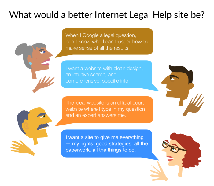
I’ve been playing around with small graphics to sum up some of the comments that the users have reported back. Here is one such visual:

In addition, at Legal Design Lab we have started a working group around this topic specifically. You can read about our process here, and our outcomes, standards, and work here.


I have been sketching out some possible templates for what a good one-pager worksheet would be, to guide a lay person through a legal process. The he one-pager has limits, so instead of thinking about it as a total ‘process guide’, I’m thinking of it more as an ‘orientation tool’ that gives the person their bearings in a legal area, with some key terminology, major red flags and warnings, and an overview of what to be doing.
As for composition, my thoughts have been to prioritize white space (not try to cram information on), use icons & faces as accents & markers on the page, and show priority through font size & spaces.
The header is also key — I’m thinking that along with the title of the procedure, the header can also give a ranking about how difficult the procedure will be. This could be a way to encourage the user not to do too much on their own, and seek out expert help while going through it.

