Categories
Class Blog

The Prototype Journey, from post it to wizard of oz

In our Prototyping Access to Justice class, Kursat Ozenc and I are leading student teams to get quickly from speculating about how the courts could be improved to implementing new concepts.

In our class today, in week 3 of the course, we had the students make some more progress along the Journey of Prototypes.

The journey metaphor is useful to hep anyone who has an idea for how a system (like courts or self-help centers) could be better — but doesn’t know how to make forward progress on it. We are creating a staged set of prototypes to develop, to go from the spark of an idea to a vetted, feasible concept.

Last week, the students had digested their research into how the Self-Help centers currently function. From this, they made journey maps and spotted opportunity points for intervention. Then, they brainstormed 30 new concepts for each intervention-point.

For example, what are 30 new ways to make sure a person can find their way from the entrance of the court to the right office? Or, what are 30 new ways we can help people get service of process right, and not fail here?

This was the first stage of their Prototype Journey — one line ideas on a post-it.

This is the most basic capture of the idea — hard to even call it a prototype. But it’s the seed that starts to lay out what the ‘it’ is, that will guide the rest of the design cycle.

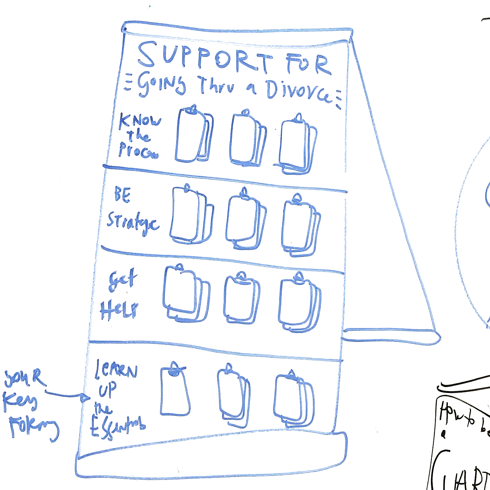
From the post-it, the next stop is the Concept Poster — a slightly more robust prototype. We had the students sort out all of their post-it ideas into a hierarchy, and choose the top 6 ideas they thought had promise to be breakthrough and feasible.

For each of these top 6, they drafted a Concept Poster version of the post-it’s concept, that added more details on functions, target users, high-level value, and implementation requirements. The Concept Posters were then compiled into a catalogue, of the Ideabook.

The value of the Idea Poster as a prototype is that it can let your team quickly, visually present a range of ideas to experts and users. They can almost go ‘shopping’ through the ideas and figure out which ones are most exciting, do-able, and worth pursuing. It can help the team whittle down further to the best one to pursue first, or to reorient based on this initial input.

The Concept Poster/Ideabook prototype can also be a check-in, with the testers letting the team know if similar ideas have been tried before, could be replicated from elsewhere, or if the team should be talking to certain experts.

Once the team gets Ideabook feedback, then they can focus in even further to the first idea they want to pursue. For this single idea, they will flesh it out to the next stage of prototype: the Storyboard.

They go from one sketch of the idea to a visual flow of the entire, ideal journey the user has with the new concept. It lays out the key steps of how the concept will work, what the user will have to do, what the system/service-provider will have to do, and what the resolution looks like. All of this is the ‘happy path’ version of an implementation, where everything goes right and works out.

Once the team documents this ideal flow, they then use the prototype to identify the key assumptions they’re making about the user, the service-provider, and the system. By laying out the step-by-step of the ideal, they can see what needs to happen or exist in order for this ideal to be realized. The prototype helps the team spot what they need to test.

From there, the team quickly moves to the next prototype mode: The Wizard of Oz version. For each of those assumptions they’ve discovered in their storyboard flow, they have to make a way to behaviorally test whether it will really work the way they expect it to. 

A Wizard of Oz prototype is an interactive realization of the idea. The user is not just reacting to a presentation of an idea — she is playing around with the ‘app’, or moving around in the new ‘space’, or considering whether to visit a ‘website’. The design team does not actually build a functional new app, space or website — but they use paper, sketches, enactment, and other hacks to simulate the concept. 

The value of this prototype is getting more realistic feedback, about whether people will really engage with the thing you’re creating, if they’ll be understand it, and if they’ll get value from it. You can test the many assumptions baked into it.

Some common Wizard of Oz versions of prototypes are making paper-sketches of apps and then assembling them into a click-through using a tool like Marvel. Or putting a sign-up sheet for  a new service or organization, and seeing how many people sign up or take the ad. Or, manually acting out a new tech-based service.

Each of these prototypes will let the team count behavior: how many people sign up? How many people are able to use the app you’re envisioning? How many people click on an advertisement for a new service? How many people stop to look and use a new electronic sign you want to install?

It also is valuable for more formal organizations like the court, to do something temporary and non-permanent — to demonstrate what is possible without asking for a large commitment immediately. Rapid prototypes of new signs, worksheets, space layout, or tech can show value, get feedback, and build momentum without any budget requests or committee approvals.

After the Wizard of Oz prototype, the teams will continue on their journey to more refined, content-rich, and tech-enabled versions of their ideas. But these first four steps of the journey help them get quick input, vetting, and refinements to make sure they’re on a promising track and doing something that will resonate with their various stakeholders.

Categories
Ideabook Work Product Tool

Legal Document Responder App

Could we build an application that would let a person, who receives a legal document or government document in the mail to:

  1. Scan it in, either through a mobile-photo-scanner, or a QR code on the document that makes it easy to capture into the app
  2. Figure out what the document says, in jargon-free language. It also would help you understand if it is valid, if it is really from the court or government. It could also tell you what consequences and process it refers to.
  3. There could be other services attached — like translating its content into another language, showing you online paths to respond to it, or letting you know what advocate could help you respond.
Categories
Ideabook Wayfinding and Space Design

Court Resource Easel Board


What is it?

It is a standing easel, about five feet high, with clips to attach a series of booklets. It would be more attractive than a standard “Wall of Handouts”, and it would have more structured categories and flows of resources to take.

For example, each easel would be for a specific Problem, and then each row of resources would be for a specific task to do within that task. There would be labels and context for what the handouts are — so people know what to take, and why they’re taking them.

How Could It Be Implemented?

The Courts could buy easels, attach clips to them, and then affix labels/colors to the easels to make the distinct rows and titles. Then, they would have to stock the easels with the correct resources each day to ensure sufficient ones are present.

Planning beforehand would be required, to decide which Problems should get their own Board, and then what the key tasks/categories should be for each board. Finally, the planning team would have to decide which documents or other resources should go on the Board.


Categories
Background

6 orders of legal design: how we can intervene in the legal system to improve it

I’ve been thinking systematically over the past few months, as I’ve been looking back over design work and initiatives going on in the world of legal innovation, and bringing design into law. Here’s one of the schematics I’ve created, to make sense of what I’ve been observing.6 orders of legal design

These 6 Orders are the categories of interventions we working to improve access to justice — laypeople’s access to and empowerment within the legal system. I’ve drawn them out at an abstract level, but tried to hint at what kind of tools and policies would be contained in each.

I’ve listed them out in order of ambition too. Like I’ve written earlier on this blog, I’m eager to move conversations about user experience and usability beyond just making more Plain Language — or even beyond just making more visual and clean-composition interventions. Those are important, but they are also just the first orders of what could be happening.

I am pushing for interventions that are more ambitious — giving laypeople more ability to understand and customize legal info, legal processes, legal options for their own wise planning. Access to Justice requires more than just presenting info — it requires creating comprehension and decision-making tools for people, who are stuck in complex systems.

And, of course, the big target is making the system less complex. Why must procedures be so laborious and obscure? If we can change regulations and procedures within courts and legal services, then we can make big strides in improving laypeople’s comprehension & ability to navigate these systems.

Categories
Background

My (sketched) vision of the future of accessible legal services

How can we help people on-ramp into the legal system in much easier & accessible ways? This is the solution that’s been growing in my mind (but still obviously a little rough) over the last few months.

Accessible Legal Services

We need to invest in several layers at once:

1) The especially hard one: Building a central repository (or a smart, organized network) of all the information about legal services that people need when they are figuring out what legal help they need & how they can get it. This includes: basic legal info about options and procedures, eligibility info about what they qualify for, service options and hand-offs to people/orgs who can help them, know your rights materials that help them spot legal issues and respond to them quickly.

2) The more designerly one: Building better tools, interfaces, and user-facing services that help people access information from this central repository in a clean, just-in-time, quick way. These are the apps, websites, kiosks, in-person meetings, SMS channels that let a person find the right help for them right when they need it.

3) The flashier one: Building a single, memorable brand that lets a person know that the legal help they’re accessing is trustworthy, up-to-date, and right for them, and that is sticky enough that they can remember it if they’re in an emergency or just far away from lawyers.

A lot to do, I know — but an exciting one, and something that is not impossible. I have been experimenting in this second camp over the past few years — with websites & SMS channels that would let people find and access content in user-friendly ways. But I keep coming back to camp #1 & #3. We need all three in order to build a truly accessible & 21st century system of legal services.

I’m excited to be working with Open Referral & others on starting to think about how #1 is achievable, at least in a small Bay Area pilot.

Are you interested in any of these 3 undertakings? Let me know!

Categories
Ideabook Triage and Diagnosis

Story-based intake

Legal Design Projects - title cards - visual stories

An idea for gathering intake information & triage-ing users to the right legal resource by giving them video scenarios/stories to watch and then figure out which best corresponds to their situation.

Categories
Ideabook Procedural Guide

Interactive Legal Maps

Open Law Lab - Visual Law - Interactive Legal Maps

I’ve been prototyping various means to deliver & build legal knowledge — with a specific consideration of bolstering Access to Justice. One pathway, of course, is Visualized Law.

I’ve been playing with it with cartoons and illustrations, and in other forms (hyperlinked, layered checklists — visual expert systems).

One promising prototype is the Visual Mind Map, that is hyperlinked & lively with images, videos, & other cues that can guide the user through. The promise of such a map is that it lets the user locate themselves in a specific cluster of resources within a broader field of information. They can see the broad scope of the area they are in, while still focusing in on what precise information they need to retrieve & actions they need to pursue.

What would such an interactive legal mind map look like in practice? See this embedded Popplet for a first generation play with this format. I’ve used Popplets a lot for my own brainstorming, paper-writing, research, and collaborations with teams. I know there is great potential in scoping out a version of such a mind-mapping specifically for legal resources.

I see a future mash-up of interactive mind map diagrams with a curated, semi-open wiki format. I would love all the legal knowledge and advice out there on a specific legal problem to be extracted out of forums, pamphlets, q-and-as, blog posts, news articles, and other random clips of text around the web — and diagrammed out clearly & visually (if not beautifully too).

I can understand legal topics better when they are composed on the page in a meaningful way, and my guess is that most people with legal problems who are searching around the Internet would also benefit from a Legal Map to ground them & guide them. No more blocks of text!

Another kind of navigator, that shows you how to get from point A to point B, from problem to resolution — this one came out of our immigration hackathon.

Legal Design Projects - title cards-12 - interactive legal map

Categories
Ideabook Triage and Diagnosis

National ad campaign for legal services

National Legal Services Advertisement campaign

Could we use the same methods of those television lawyers who bombard daytime-tv-watchers with ‘Are you injured? Can you sue? Call now to find your rights!’ — to increase lay people’s awareness of their rights, of civil remedies, of free or low-cost legal services?

Categories
Ideabook Procedural Guide

Legal navigator concept sketches

Legal Navigator Images

One of the projects on my front-burner is getting a great legal navigator built, that takes a person step-by-detailed-step through a legal process. Here are some of the sketches from my notebooks on how I hope to actually lay these out on a webpage and/or printed page. Composition has turned out to be a fun but non-linear design challenge. How to lay out lots of complicated steps thoroughly, but without overwhelming the user? You can see some of my rough initial thoughts here in my sketches.

Process Guide - Triage and then guide - Design Process - Legal Navigators

Categories
Background

What does a good Court Self-Help website look like?

Last summer, I started a design review of the California Judicial Council’s Self-Help webpage. It is meant to be a central hub for lay people in the state to find legal resources & referrals for their life problems. The goal is that the state court can provide a trustworthy & centralized hand-off to either local, court-sponsored Self-Help centers (where pro per litigants — without a lawyer — can get court lawyers’ help in figuring out the right forms to fill out, and how to fill them out) or to other legal bodies.

So what should this website look like? I’ve been sketching out some designs.

Self Help online presence design - Margaret Hagan

Here are some of the functions that the site should have:

For the Main Content

  • A bolder, graphic welcome & orientation message
  • Prominent, image based links to the most commonly clicked help pages
  • A 1-2-3 storyboard of how a lay person can use this site, what functions it will provide to them (and what the dominant flow through the site will be)
  • The full collection of resources organized into chunks, framed around lay people-terms of the ‘legal problem’, and each marked with their own icon (and a search/filter function at the top of this section of resources)

For the Sidebar

  • Very prominent search bar — with big text and set off with other bg color — and perhaps 300 px tall
  • En Espanol in larger text
  • Reframing the Librarian-chat in a more conversational way, with a sample question in gray
  • Reframing the map in a conversational way — around the question of “Where to find help”

Apart from these specific functions, I’ve also drawn up some more general User Experience/User Interface guidelines for those designing online legal portals, like this self-help site.

CHECKLIST 1: SIMPLICITY & GUIDANCE

Orient your user immediately as to what path they may want to take. Present a roadmap that orients them, that lets them see what you have on offer & where they may want to go. Anticipate what they will likely need & tell them the pathways to get the information & tools to get them there

Give relevant Entry Points to your site’s resources. Present scenarios or personas as entry points. First present the most basic possible pathways (likely, categorize the type of legal situation you’re dealing with, choose a ‘type of law’ path).

Build a Clear Hierarchy: Present information in a clear, thoughtful hierarchy. Only disclose what is necessary at that moment. When you do present it, make sure it is presented with clear logic & rationale.

Do not present long lists of resources. Present resources in categories based on answers to specific questions (how to solve this need? how to accomplish this task?). Do not present alphabetic lists. Categorize and group them. Present indexes based on how your user understands her problem, names her problem, categorizes her problem. That is not usually be the first letter of a term for the problem — a term she may not even know.

Stage information. Present very limited information in the first place, with a limited set of options that the user can pursue — and gradually uncover more specific, in-depth information she is seeking out. Have a comprehensive set of information on your site, but do not present it at first. Let the user unpack it if she wants it. Otherwise, give summaries, shortcuts, headlines, and other ways to digest main points without having to spend time reading through comprehensive explanations, lists, options, etc.

Be consistent, be familiar. At each step, have a consistent template of information you’re providing to them. Borrow these patterns from other dominant services and products in your area. Put your user at ease so they know what to expect, where to find things, how easily to scan & shortcut through your material.

Create a Dominant Flow-Pathway. Have a path of least resistance, especially for the new user and the naive user. They want to just flow through process in the quickest, least thoughtful way possible (the ‘No-Brainer’ mode). Make it easy to stay on path — don’t give lots of other options or pathways when they’re on a path. If most of your users are naive to the experience or content, then rein them in. Give them more of a single-use path, that lets them accomplish a task with very clear & strict direction from you.

Give Shortcuts: Especially for expert users, allow them to jump off your dominant flow-pathway. Give lots of shortcuts to find the right bit of information for the user who is coming to the site ‘with a bullet’. Right from the first page, let the user go to the Specific Tasks that she wants to accomplish, through a search box, an index, or a common-shortcut list. Don’t lock your user into the dominant-path. Do not make them feel trapped. Let the user ‘Off-Road’, wandering farther afield, to dive in more, to try things out, especially if they are in expert mode and want something very specific. Give these off-roaders the ability to undo, reverse, and go back to the home-path.

Use white space, do not crowd: space out all of the resources you are providing. Add icons and pictures to flag different categories, tasks, path-entry points. Do not crowd pages with lots of text and options.

CHECKLIST 2: USER-FRIENDLY CONTENT

  • Architect your resources into an integrated system. Take a step back to look at all the resources you want to offer to your users, and organize them into a coherent flow of content. Sort & categorize it, cut repetition, and find where you are missing resources that you need to collect.
  • Unbury your materials out of PDF and Word documents. When you are presenting legal documents, forms, resources, or otherwise to your user, present them whenever possible on your website, in html, and not as an attachment in another file format (most common culprits: the links to the .pdf download or the .doc download). Take it out of these other formats and lay it out into the flow of your site. If the material is meant to be filled in by the user ( like a form) or printed off (like a training manual) then give them the option to download the .pdf or .doc — but always present it live on your site first, and give the user a clear way to download it in the non-html format.
  • Only use the plainest of plain language. Rewrite your existing resources into terms that are meant for the layest of lay users, even when your target audience is very well-educated & familiar with law. Take out all jargon, or define it immediately & in simple terms if you must use jargon terms.
  • Make your knowledge visual, graphic, and easy to look at. When you can, transform your text into (or add to your text with) icons, photographs, diagrams, cartoons, and scenarios. Even putting a face on each page will help your user pay attention & relate to the content better. Particularly when you want a user to pay attention to a piece of content, put an image with it.
  • Convert long paragraphs into digestible formats. Big chunks of text will induce gloss-over & misunderstanding. Break them apart intelligently & strategically. Use as many checklists and bullet-points as possible, so that the user can designate individual steps and concerns easily.
  • Keep your content Up-To-Date & Correct. Do not let your information go to seed. Keep pruning. Remove resources that are out of date. Check back with contributors. Recruit new donations. Recruit updates. Users will tune out from your resource as a whole if even part of your resources contain faulty or irrelevant information.
  • Ensure your site is mobile-friendly. What does your site look like on a mobile phone? Make sure your site is responsive to the screen size, so the text & containers all change size for optimal phone experience!

CHECKLIST 3: INTERACTIVITY & RESPONSIVENESS

  • Allow for multiple modes of interaction. Give users multiple ways to get their intended task done, based on their user preferences. Like, some may want to browse to find the right thing and check it out; others may want to search through query to get right to an answer for their query.
  • Give rewards, sense of achievement. Let the user check things off, feel they have progressed, be rewarded by the interface for having got through material. Provide immediate reactions when a user has taken a step, so they know it has registered & they feel satisfied that it is done.
  • Make the possible interactions direct, clear & limited. Make it very clear to the user at each page/section/step what they should be doing— and what the effect of their actions will be. Give clear tips for each possible action the user might take. Give one screen per goal. Don’t crowd with too many functions or tasks, make it clear what the goal is.
  • Reduce the number of clicks. Let the user stay on the same page for as long as possible, but stage & selectively reveal/hide the information on the same page. Put in enough details for a person to know what they’re clicking on (don’t make them click for them to find out what will be at the link). You can use hover to give the details without a click. Also try to avoid too much scrolling, closing, clicking…
  • Once a user has made some choices, give Targeted & Bordered Resources. Once a person has chosen a certain pathway, then you know which specific area of your site that she wants to be in. Wall off the other resources on the sites from her, so that she doesn’t accidentally cross over into another area that doesn’t apply to her. She can come back to the home & restart her search if she wants to enter another area of resources.
  • Give Status Mechanisms to keep users aware. Tell your user if there’s been a failure, if conditions are changing, what the status of a process is, when things are being saved, what can be done/undone.