Last Friday was the final class in the Stanford Law School/d.school class Prototyping Access to Justice. Kursat Ozenc and I were teaching the course as a practical, service design effort.

The big question guiding the work: if hundreds of thousands of Californians go to the courts to deal with their divorce, child custody, debt, and housing problems — how can we make the courts work for them, on their own terms? We know that growing numbers of people are trying to use the courts without a lawyer, but that the courts have been designed for lawyers — with complex procedure and intimidating jargon is so complicated that only lawyers can really figure it out.

Students were given initial design briefs that we had crafted from our earlier research into California Courts’ Self Help Centers last year. In the first version of this class, we followed litigants through their court journeys and interviewed professionals to identify key opportunities and breakdown points.
This quarter’s classes aimed to use this groundwork to jump more quickly into prototyping and testing. Each of the design teams worked on site at San Mateo County or Santa Clara County courthouses, and at the Stanford d.school labs — going through 3 cycles of scoping out a concept design, making a prototype of it, and testing it with many different stakeholders.
We ended up with seven proposals for the courts to pilot. Two concerned how to remake the court building and design of physical space. Two were new modes of guides, to present better ways to guide litigants through complicated tasks. One was about better form completion. One was about new modes for court feedback. And one was about better preparing court users before they come to court for the first time.
The teams made videos, maps, and presentations to capture their proposals, and we present them here for you to review. We ask you for your feedback now — because we are vetting these seven proposals to decide which to continue working on and possibly pilot with the courts.
1. Redesign of the Court Building: Visual Lines + Signs for Empowered Wayfinding
Team Chuka Ryori were tasked with helping people just as they arrived at the court the first time. How could we make people feel more supported, less confused and intimidated, and more capable of getting through the process efficiently?
Visual Wayfinding in Courts from Margaret Hagan on Vimeo.
Their proposal is to launch a coordinated, color-coded, pictogram-based wayfinding system in the court building. There should be color paths on the floor for the most common user destinations, with pictograms and a palette that supports finding the right place.

They did guerrilla-design work, by “decorating” the actual court with new lines, signs and pictograms to test how users reacted. The results were overwhelmingly positive. Our next steps are to refine the color palette and pictograms, and then work with the court to implement the new lines and signs.
2. Redesign of the Court Building: Respectful, Transparent Line Waiting
Team Golden Design Warrior was focused on the next moment in the user’s journey, when a person found the Self Help Center, but now must deal with the long and confusing wait to get services. After several different ideas to change the layout of the space, the team moved to focus on how to set up lines that gave users greater transparency and more comfort while waiting to be served.
New Line Waiting Design in Courts from Margaret Hagan on Vimeo.
The team identified that people were rushing to wait in a confusing line. They were stressed out, and in turn stressing out the staff who felt as if they had to barricade themselves in against a huge amount of people who wanted things from them. The goal of the system is to give people a clear ticket that would give them an explicit place in line, and would let them relax, sit down, and see when they could expect to be served.
The first pilot is just with laminated cards and a person distributing them near the entrance. Then it can be scaled to an automated ticketing service.

This prototype has tested remarkably well with both litigants and professionals, reducing both stakeholders’ stress and giving them more of a sense of control. With the simple intake during the sign-up, the professionals can better prep for the clients’ cases. They also get insulated from the pressure of a huge group of people hovering around their doors.
The joy of this design is how a simple service intervention can have a huge experiential payoff — making the experience of visiting court or working there be less anxious, confusing, and stressful.
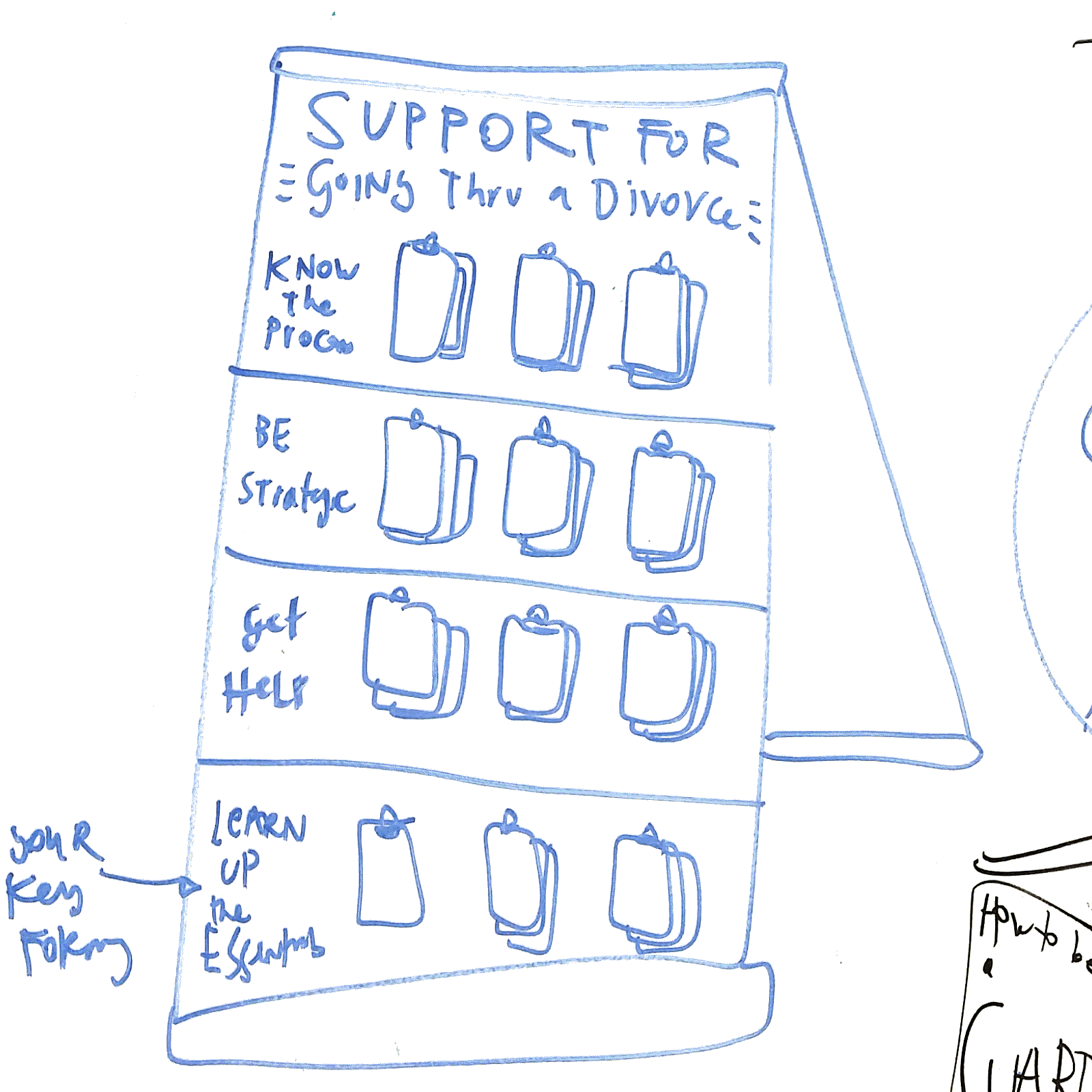
3. Visual Book Guide to Following a Legal Process
Instead of worksheets and forms, or instructions told out loud before a person leaves the Center, how do we convey instructions and guidance to them? How do we make it easier for them to follow the procedure, so they stay on track and get it all completed correctly and on time?
Team Jiffy Justice proposes a visual booklet, that gives people a step-by-step map of what the process will look like, what to do, and how exactly to finish the steps. It’s about envisioning, modeling, and taking legal actions out of abstract text language, and into clear, grounded situations.
My Court Case Guide for self represented litigants from Margaret Hagan on Vimeo.
The team made a map that can be printed as a poster, a handout, or part of the book. It gives the systems-level view of the case. People liked this as an orientation material, but still wanted more detail about exactly what each of these steps entails. A high-level view helps give a person the mental model of the system, but they want to dig into more specific instructions and strategies.

The team made the booklet to enhance the guide, to go from the map to the detailed instructions.


They built it specifically so it could be easily printed on common paper sizes by the Self Help Center. It incorporates the map, but then with details of the forms, the filing info, and common flags and warnings.
The next, scaled-up version of this would be a digital version (most likely on mobile) that has the step-by-step guidance and the map for the person to follow along as they go through the process.
4. Text-based coaching through complicated process
Team Exit took this same challenge — how to help people through complicated procedures that they often fail at? Their proposal is more tech-centered, harnessing the power of the mobile phone. They created a prototype of the RemindMe Text system, in which litigants would get coaching reminders, customized due dates, and clear blasts of instructions about what to do to serve process (a particularly thorny part of a process, that people often screw up).
Court Text Messaging Project: RemindMe Text from Margaret Hagan on Vimeo.
The team embraced the principle of staging information and providing it at the right moment and context. Rather than give huge worksheets with general information all at once, segment it into specific messages and customize it with the user’s own information.

This program could later incorporate other kinds of messages, beyond reminders — including the maps and visuals that Team Jiffy Justice had in their booklets, or the wayfinding and prep materials that other teams proposed.
The great part of this proposal is that the text message channel, opened up between the courts and the litigants, can allow for a diversity of services to be provided in the future. As more technology is developed for court services, they can be integrated into this same channel.
5. Prep People Before Court with Warnings and Key Info
Even before people come to court, how do we make sure they come prepared to make the most of the day — and not waste it? Especially if it takes several hours to even get to speak to someone at court, how do we make sure people come with the paper, translators, and knowledge enough to get their tasks accomplished?
PrepMe: Pre-Court Information Strategy from Margaret Hagan on Vimeo.
PrepMe is an idea to do better outreach around this Prep information, via websites, mobile apps, and other court materials. It should be in multiple languages, and show very prominently the most common prep information people don’t know: about translators, child care, and timings.

This information can be presented also in court correspondence, posters, fliers, and any other ‘touchpoint’ where people are thinking about using the court system and planning for how to do it.

It prioritizes language access as a fundamental principle of design of court information, rather than as an add-on afterthought.
6. Help People Fill in Forms Better
One of the big failpoints in the legal process is the correct completion of forms. Team Remind proposed two prototypes — one paper-based, the other tech-enabled for improving litigants’ ability to complete Service of Process forms.
The paper-based system involves tagging up and creating a model completed form, that would guide a person through exactly how to follow this model.

The tech-based guide uses a Google Doc form to let people enter in the key data points, and then uses Python to fill in the form with this data. The litigant (or the process-server) never needs to see the Judicial Council form except when they print and file it. The Python script does the completion for them.

The vision of this prototype is to have a 2-pronged tech/paper strategy, so that resources are allocated to different types of users in the system. It is also to come up with cheap hacks to use the power of technology. Rather than contract with an expensive, proprietary vendor to provide for form-filling, the goal here is to mash together existing, modern, mobile-friendly services (like Google Docs) to get a very cheap and quick working system of filling in forms.

The other big insight here was in the power of having an interdisciplinary team, with lawyers and computer scientists working together to find the most strategic uses of technology that would serve the legal system. Lawyers should know the power of Python — a major takeaway for our partners.
7. Gather user input and experiences to feed back to the Courts
Team Law4U drafted a prototype of a kiosk in the Self Help Center’s office, that would ask simple questions from people as they’re waiting to get service. They’d be able to rate the court’s quality of service and give ideas for improvements.
Feedback systems for Courts from Margaret Hagan on Vimeo.

In the future, this program could also recruit litigants to join a Standing User Testing panel, in which they’d be compensated for reviewing new court efforts or giving more feedback to the courts. This would feed into a broader culture of testing and experimentation in the system.
—
These seven prototypes are the result of 9 weeks of hard, creative work by our Prototyping Access to Justice class. Many thanks to the wonderful students and coaches!
We are soliciting feedback now on these prototypes, so that we can then proceed to pilot implementations of some of them in the courts. Let us know what you think!